Build an Incident Postmortem Timeline in Confluence (Mermaid, Copy-Paste)
Every incident has a story hidden inside a pile of timestamps: alert fired at 09:42, nobody acknowledged until 09:47, an engineer escalated at 09:54, a workaround landed at 10:20, services healthy at 10:31. Individually the timestamps mean nothing. Laid out on a timeline, they tell the story — and the story is what a postmortem is for.
Confluence is where incident postmortems already live. What Confluence does not give you is a native timeline. This guide shows you how to fill the Timeline section of an incident postmortem with a Mermaid diagram: one copy-paste timeline that visualizes detection → escalation → resolution, plus a sequence diagram that shows exactly how the failure propagated between services.
Quick answer: To add an incident postmortem timeline to Confluence, install Mermaid Plus for Confluence, create the postmortem page, and paste a Mermaid timeline block into the Timeline section — one section per phase, one Event : Description line per fact. For the failure path, add a sequenceDiagram under 'What Actually Broke'. Both examples below are copy-paste ready. A timeline written live during the incident is worth more than one reconstructed afterwards.
Why a Timeline Is the Backbone of an Incident Doc
An incident postmortem has one job: make the failure boring to repeat. That only works if the causal sequence is legible. A wall of timestamps in a table forces the reader to reconstruct the order themselves — and everyone reconstructs it slightly differently. A timeline makes the sequence the structure of the paragraph, not the byproduct of one.
A good incident timeline separates two things that postmortems routinely blur:
- The facts — what happened, when, to whom. This is the timeline: strictly chronological, no opinion.
- The analysis — why it happened, whether it could be prevented. That lives below, after the reader has seen the sequence.
When a postmortem holds those apart, the debate moves from "that's not what happened" (a fight about facts) to "what do we change" (a fight about fixes). The timeline is what makes the first fight skippable.
The Atlassian Postmortem Template, Anatomy
Atlassian ships an incident postmortem template where a Timeline section is a first-class citizen. Its anatomy, paraphrased:
- Summary — one-line severity and impact.
- Timeline — chronological sequence of what happened, from detection to resolution.
- Root cause — the technical and systemic reason.
- Impact — affected services, customers, metrics.
- Action items — what changes to prevent recurrence.
If you have used it, you have already hit the gap: the Timeline section is an empty canvas. Teams default to a table, then restructure it three times because tables hide the shape of the incident. Mermaid fills that exact section with a rendered diagram, and the syntax is simple enough that an on-call engineer can update it in a war room.
Copy-Paste Example — Detection to Resolution
Here is a timeline for a real-shaped page-degradation incident. One section per phase; each line is an event with a note. Paste it, then swap the content for your own timestamps:
timeline
    title Sev-2 page degradation — 2026-09-18
    section Detection
        P95 latency > 4s alert (Prometheus) : 09:42
        On-call acknowledges : 09:47
        Ack missed the 3-minute SLO : 09:47
    section Escalation
        Declared Sev-2, war room opened : 09:54
        Incident comms posted : 09:58
    section Mitigation
        Suspected config drift in LB rule : 10:05
        Candidate config removed : 10:14
        Latency back to baseline : 10:20
    section Resolution
        Declared resolved, monitoring : 10:31
        Postmortem drafted from this log : 18:00
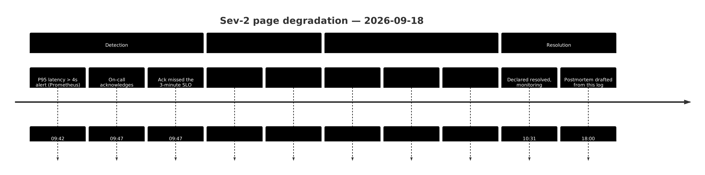
Three things this diagram does that a table does not:
- The shape of the incident is visible instantly — you can see the 5-minute gap between alert and acknowledgement without scanning a column.
- The mitigation phase is where it is on the page — plan vs. response timelines separate cleanly because each
sectionrenders as its own horizontal band. - It stays cheap to update mid-incident — adding
10:26 : Failed cache reloadis one new line and a republish.
Anatomy of the syntax
The timeline keyword opens the diagram. title sets the label. Each section is a phase, and each indented two-space line under a section is Event : Description:
| Part | Meaning |
|---|---|
section Detection | New phase band on the timeline |
P95 latency > 4s alert (Prometheus) : 09:42 | Event with a note — the event text first, the timestamp (or short period label) after the :. This event : note : period order is what Mermaid expects; leading with a bare time breaks the parser. |
| Indentation of two spaces | Nesting under the section |
Keep entries short — a phrase, not a sentence. The annotation is where the detail goes. Long event labels wrap and make the timeline tall instead of scannable.
Adding a Sequence Diagram for the Failing Request
A timeline answers what happened when. It does not answer why the user's request got slow — that is a data-flow question, and it deserves a sequence diagram. Alongside the timeline, a sequenceDiagram showing the actual failure path makes the root-cause section write itself.
sequenceDiagram
    autonumber
    title Provider hang — missing retry deadline
    participant U as User
    participant G as API Gateway
    participant B as Billing Service
    participant P as Payment Provider
    U->>G: POST /v1/charge
    G->>B: forward request
    B->>P: call provider
    Note over P: Provider hangs — no response
    P-->>B: no reply within 30s deadline
    B->>P: retry (still hung)
    B-->>G: 504 after 60s
    G-->>U: 504 after 65s
    Note over U,P: Missing deadline on retry compounded latency
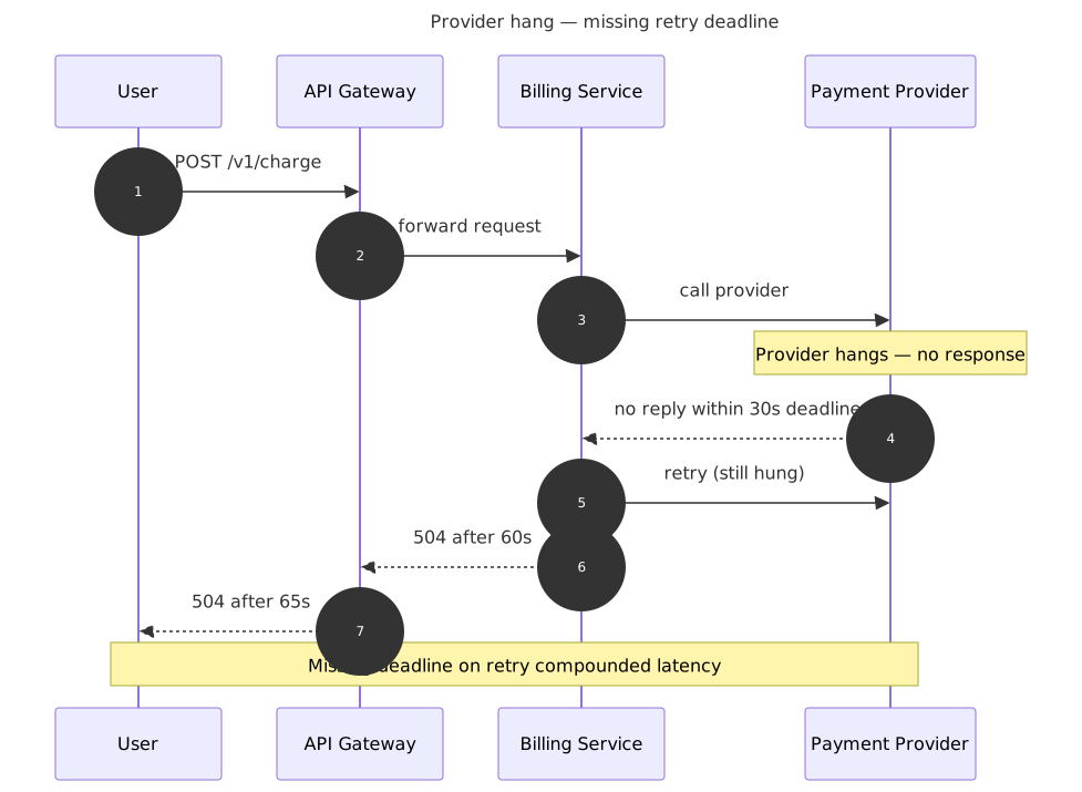
Read it as a story: the request enters, reaches the provider, the provider hangs, and — because the retry had no deadline — the response the user got took 65 seconds instead of failing fast. That single diagram carries the mechanism of the incident, which the timeline's 10:05 : Suspected config drift note can't.
Keep the sequence diagram minimal — five participants max, one failure path. A sequence diagram that models the whole system is a system diagram; a postmortem wants the failing path.
Keep It Current During the Incident, Not Just After
Most postmortem timelines fail because they were written 48 hours after the incident from memory, Slack scroll, and monitoring exports. The gaps are where blame-creep grows.
Instead, treat the timeline as a living artifact inside the war room:
- Create the postmortem page at incident declaration, not at resolution. The template gives you the Timeline section already.
- Append one line as each event happens — detection, handoffs, escalations, mitigation attempts, failed attempts too.
- Freeze it the moment the incident closes. Do not polish the timeline afterwards; polish the analysis, and leave the facts as they were recorded.
This is a habit, not a workflow feature. But one thing makes it possible in a war room instead of optional: the diagram is plain text. Pasted into Mermaid Plus, it edits in the browser in seconds and re-renders on republish. No dragging shapes, no waiting for the composite draw.
Where timelines record plans and schedules — release trains, sprint milestones, project phases — the Gantt chart in Mermaid is the counterpart. A postmortem is the one doc where you want events, not durations, which is exactly what the timeline diagram gives you. For the planning-side version, see the release timeline in Jira guide.
Which Diagram Fills Which Section?
| Postmortem section | Diagram | Why |
|---|---|---|
| Timeline | timeline | Chronological facts, phases visible at a glance |
| What actually broke | sequenceDiagram | The failing request's path between services |
| Root cause analysis | ishikawa fishbone / flowchart | Drill into causes after the sequence is agreed |
| Impact summary | pie or xychart | Metrics over time, resource share |
The timeline and the sequence diagram cover this guide's scope; the fishbone/root-cause diagrams are the natural next step once the sequence is nailed down.
An incident gets a second chance only if its postmortem is unambiguous. A timeline makes the facts impossible to misread, and the sequence diagram makes the mechanism impossible to hand-wave. Install Mermaid Plus for Confluence, drop the two examples into your next postmortem, and let the diagram do the arguing.
Related Guides
- How to build a release timeline in Jira — the Gantt counterpart: version milestones, multi-team tracks, and launch sequencing
- Mermaid diagrams for Jira sprint workflows — sprint-scale timelines and the diagram types ops teams actually use
- Create Mermaid diagrams in Confluence — the full guide to all 29 diagram types on Confluence pages
Try Mermaid Plus for Confluence
All 29 Mermaid diagram types with live preview and one-click templates — free for up to 10 users.
Get it on the Atlassian Marketplace